Wayfinder - Logo Development
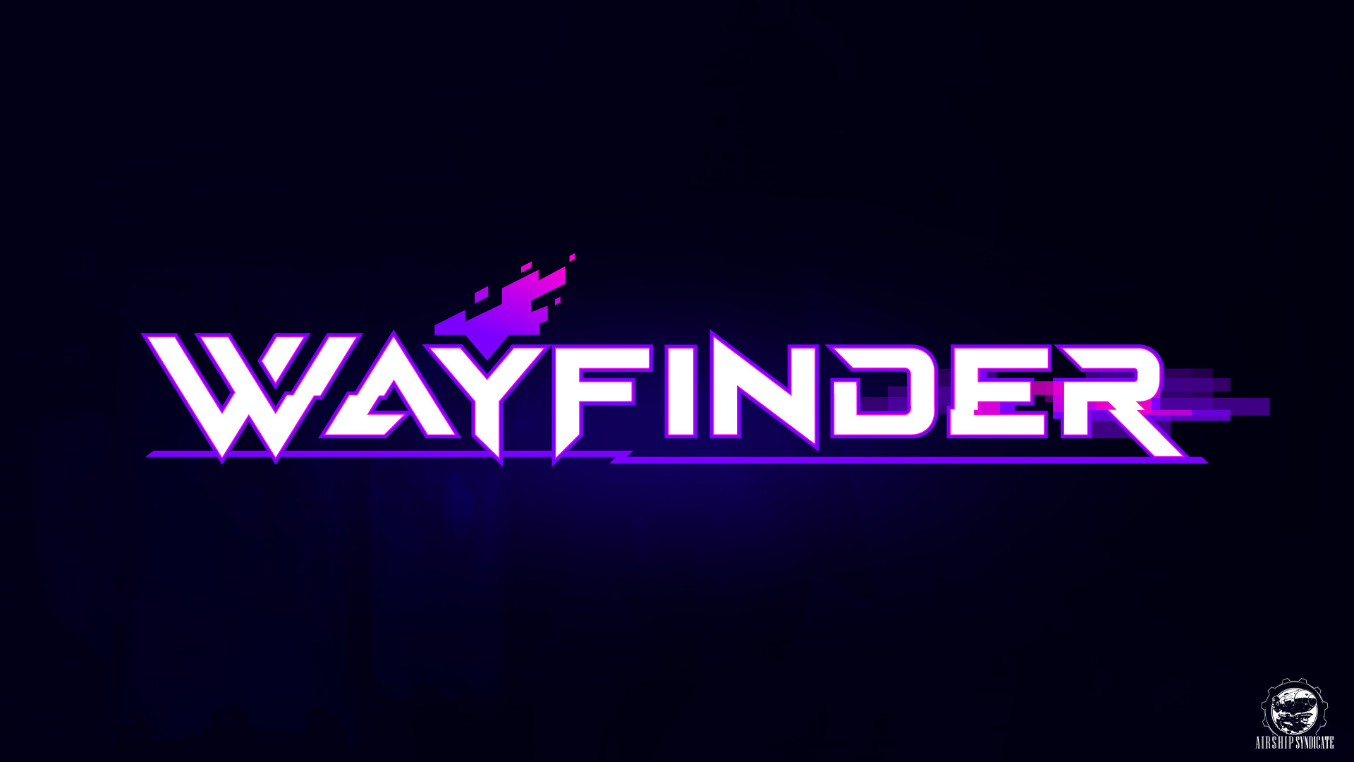
Final Logo Design. We moved away from gritty elements and leaned into "Synth Fantasy", which we describe as classic fantasy tropes viewed through a digital-age lens. Designed in collaboration with Hammer Creative.

Final Emblem Design. Really happy how we were able to keep the flame element through every draft of the logo. The pixelated flame and embers worked really well to sell the Synth Fantasy motif.

Original Logo Design. This was the logo used on original pitch documents and concept sheets.
Illustrated elements by Joe Madureira and text treatment by Ryan Stefanelli.

Early Draft - I originally set out to revamp the existing logo with a bigger focus on survival and gritty themes. I also began pushing a more hand made look, incorporating cuts and scratches.

Early Draft - Emblem Designs - the torch has always been a central icon, but I also tried my hand at simplifying the torchbearer into a square aspect icon. Still one of my favs!

Intermediate Draft - a while into development we had shifted to thinking of Wayfinders more as a super hero team, and I played with a tilt and skew to evoke XMEN vibes.
Wayfinder - Logo Development
One of my absolute favorite things is developing new intellectual properties. Wayfinder is Airship Syndicate's first original IP and I jumped at the chance to lend a hand in its branding, identity and logo treatment. I redesigned the Wayfinder logo multiple times during its development while trying to establish the brand identity. Early on the game was more of a traditional fantasy, with a created character and progression more alike with MMOs like WoW. The logo and core palette were much more subdued compared to today, featuring a more crafted and aged look. Over the course of development, the tone and structure shifted to be much more tech-fantasy ("Synth Fantasy" is what we coined to describe our combination of futuristic designs mapped to fantasy conventions) and became character focused. This allowed us to move away from some of the gritty and survival based shape language to bold, clean letter forms, colorful palettes and digital era glitching effects. I worked with Hammer Creative to develop the final logo and icon design, and am really happy with where it ended up.